20 Colors That Go with Red to Transform Your Space
Red is a bold, dynamic color that instantly draws attention and adds energy to any space. Choosing the right complementary colors can transform interiors or exteriors, balancing warmth and vibrancy. 20 Colors That Go with Red will guide you in creating visually stunning and harmonious environments.
From cozy living rooms to lively kitchens and striking outdoor areas, pairing red with complementary hues enhances mood and style. Carefully selected shades can evoke emotions, highlight architectural features, and harmonize furniture, décor, and accessories.
Whether your goal is subtle elegance or bold drama, these color combinations provide versatile inspiration. Layering tones, textures, and accent colors allows red to shine while creating cohesive and inviting spaces.
1. Red and White

Pairing red with white creates a crisp, clean, and timeless aesthetic.
White balances the intensity of red, making it ideal for walls, furniture, or décor accents. This combination works well in kitchens, dining rooms, and modern living spaces.
Add patterned elements or textures like rugs, pillows, or artwork for visual interest. The contrast of red and white evokes freshness and elegance while keeping spaces bright and open.
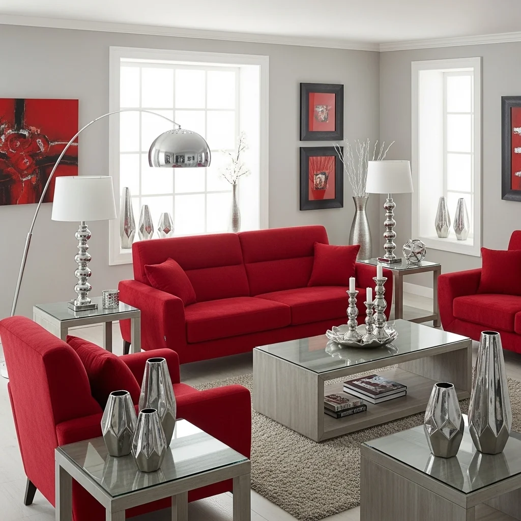
2. Red and Gray
Combine red with gray for a sophisticated and contemporary look.
Gray tones soften the vibrancy of red, creating a balanced, neutral backdrop for furniture, textiles, and accessories. This pairing is perfect for offices, living rooms, or minimalist interiors.
Use lighter grays for subtle elegance or charcoal for dramatic contrast. Adding metallic accents like silver or chrome enhances modern appeal and depth.
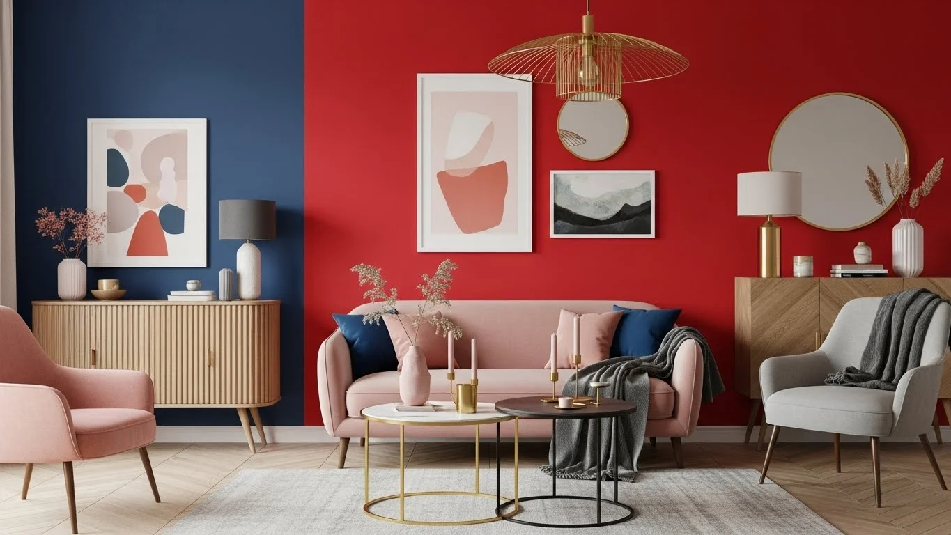
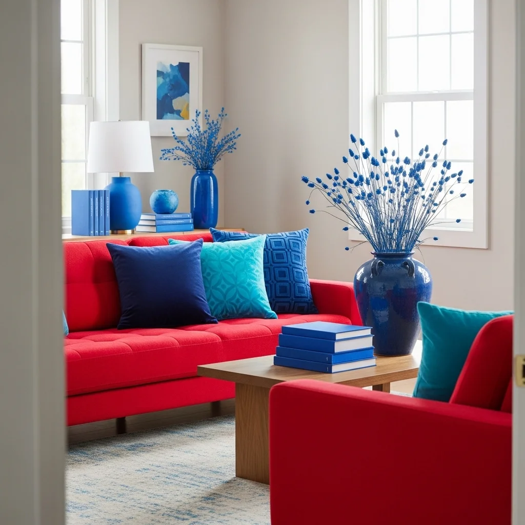
3. Red and Blue
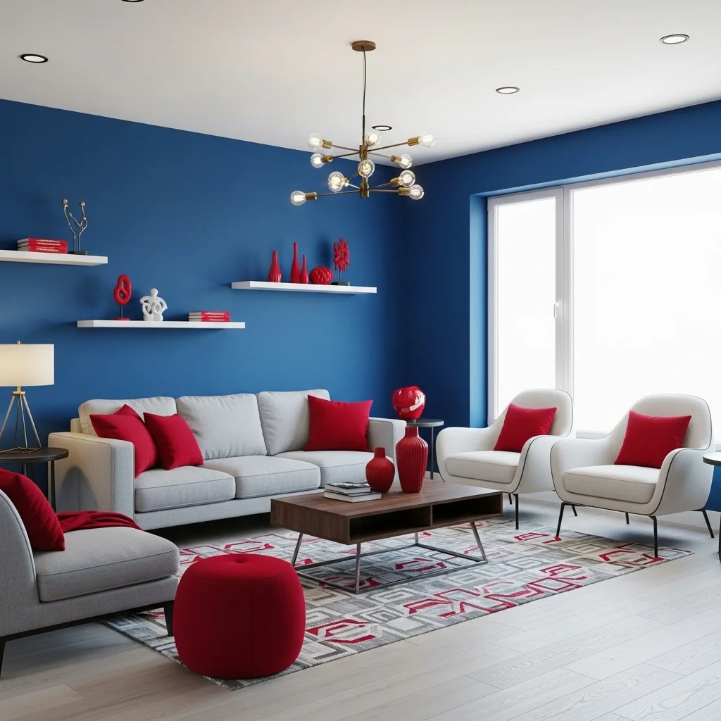
Red paired with blue evokes energy and balance, perfect for dynamic spaces.
Navy or deep blues complement red’s warmth, while lighter blues create a playful, airy feel. This versatile pairing works in living areas, bedrooms, or accent walls.
Incorporate patterns, stripes, or decorative accessories to tie the colors together. Layering textiles and furniture in red and blue ensures a harmonious, visually stimulating environment.
4. Red and Green

Red and green are classic complementary colors with bold visual impact.
While often associated with holidays, carefully chosen shades—like olive, sage, or emerald—create elegance and sophistication year-round.
Combine deep green furniture, plants, or accent walls with red décor for a balanced and rich palette. The interplay of warm and cool tones adds depth and vibrancy to any space.
5. Red and Gold

Pairing red with gold adds luxury, warmth, and opulence.
Gold accents—through lighting, décor, or hardware—elevate red tones, creating a rich and inviting atmosphere. Perfect for living rooms, dining rooms, or entryways.
Mix textures like velvet, metallic finishes, or polished wood to enhance visual interest. This combination conveys elegance, celebration, and warmth in interiors and exteriors alike.
6. Red and Black
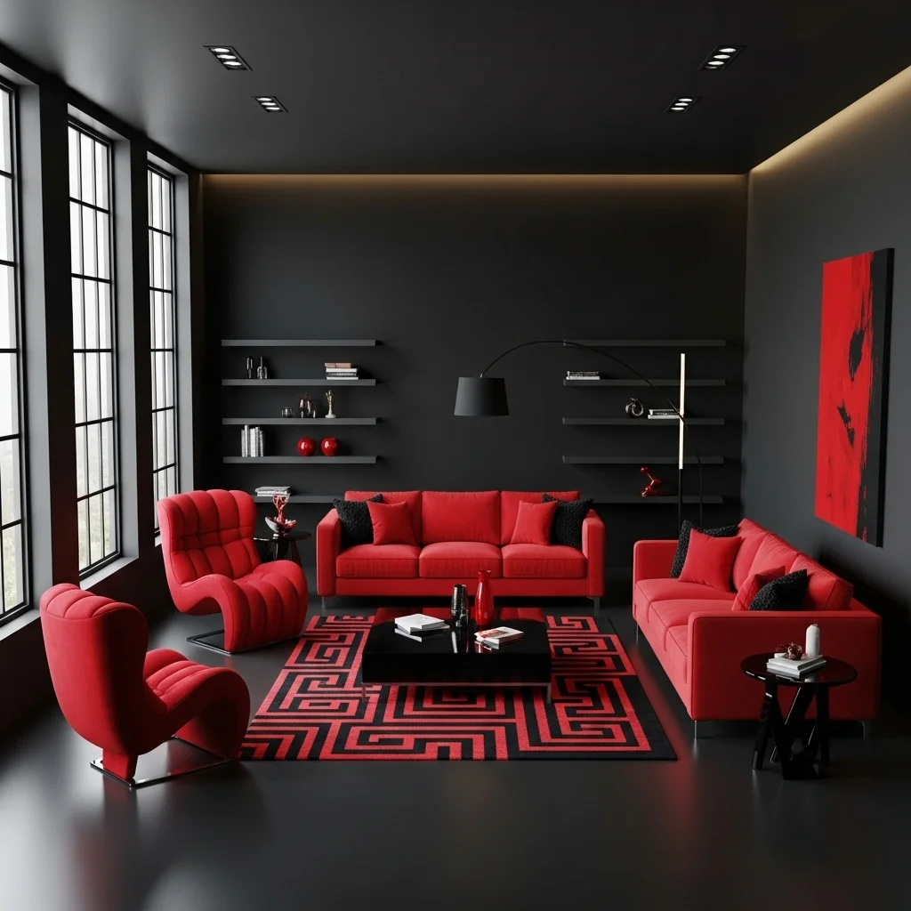
Pairing red with black creates a bold, dramatic, and modern look.
Black grounds red’s intensity, making it perfect for accent walls, furniture, or décor pieces. This combination evokes strength, sophistication, and a touch of elegance.
Use small black accents or patterns to avoid overwhelming the space. Combining textures like leather, metal, or matte finishes enhances depth and creates a visually striking environment.
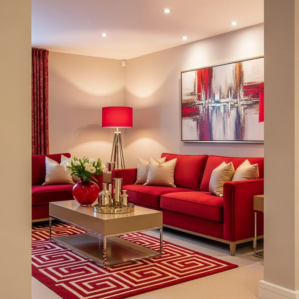
7. Red and Beige
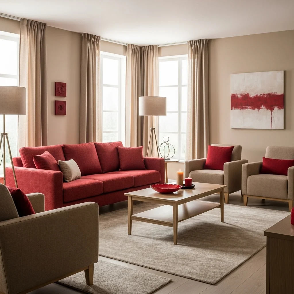
Red paired with beige brings warmth and balance to interiors.
Beige softens red’s vibrancy, making spaces feel cozy, inviting, and elegant. Ideal for living rooms, bedrooms, and home offices where comfort and style are both essential.
Layer textiles like rugs, cushions, and curtains to harmonize the palette. Beige acts as a neutral backdrop, allowing red elements to stand out without overpowering the room.
8. Red and Pink
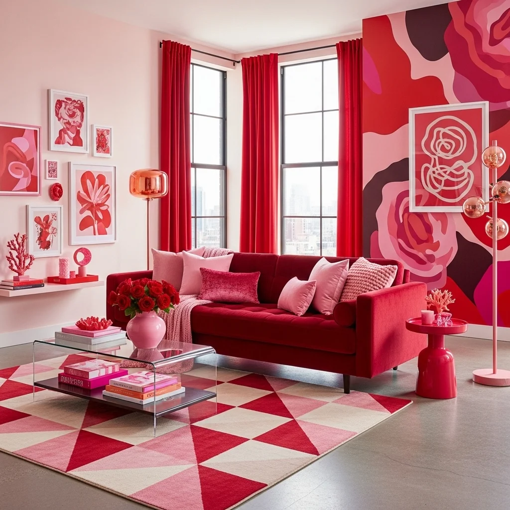
Red and pink create a playful, feminine, and vibrant combination.
Soft pink tones paired with deep reds generate warmth and depth, perfect for bedrooms, creative spaces, or accent décor.
Mix patterns, textures, and materials to avoid monotony. Incorporating plants, artwork, or metallic accents like gold or rose gold enhances elegance and cohesion.
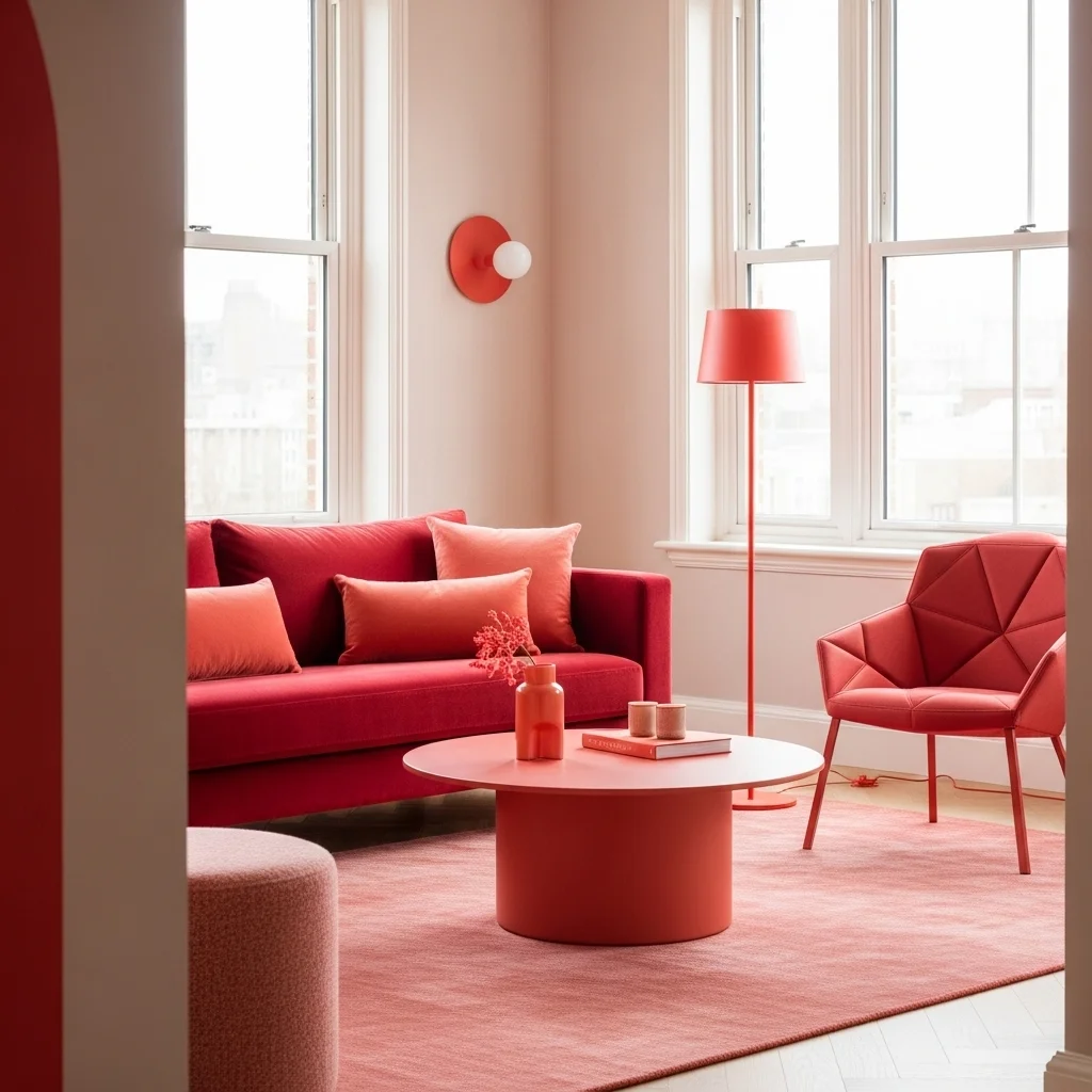
9. Red and Orange

Pair red with orange for an energetic, lively, and dynamic aesthetic.
Both warm tones create a sense of movement and vibrancy, ideal for kitchens, dining areas, or social spaces.
Balance intensity with neutral furniture or flooring to prevent overwhelming the senses. Layering shades—from muted terracotta to bright coral—creates depth and visual intrigue.
10. Red and Teal
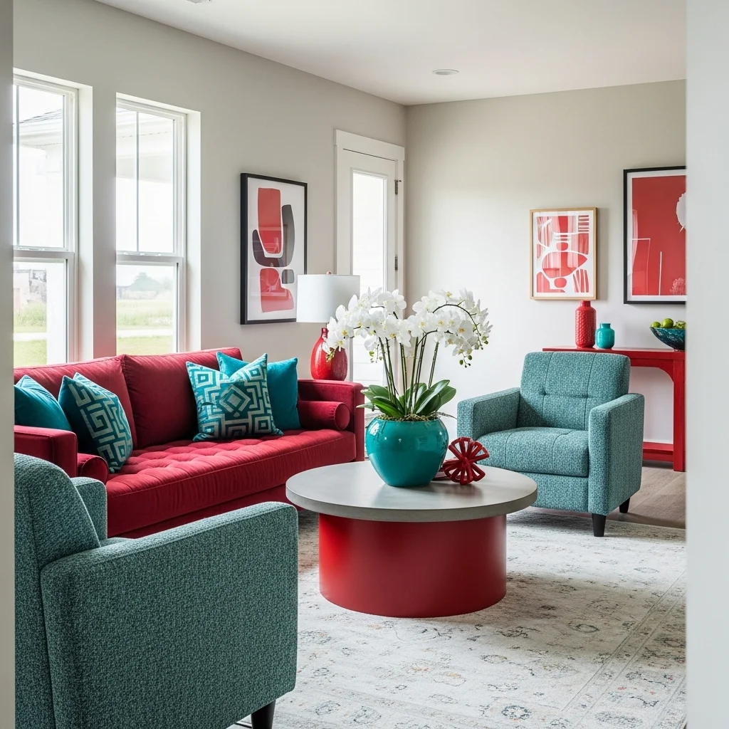
Red and teal form a striking complementary color pairing.
Teal’s cool undertones balance red’s warmth, creating harmony and sophistication. This combination works beautifully in living rooms, bedrooms, and accent décor.
Use teal in furniture, cushions, or wall accents, while keeping red in smaller décor or focal points. The mix creates contrast, elegance, and a lively yet balanced atmosphere.
Read also. 19 Bay Window Decorating Ideas
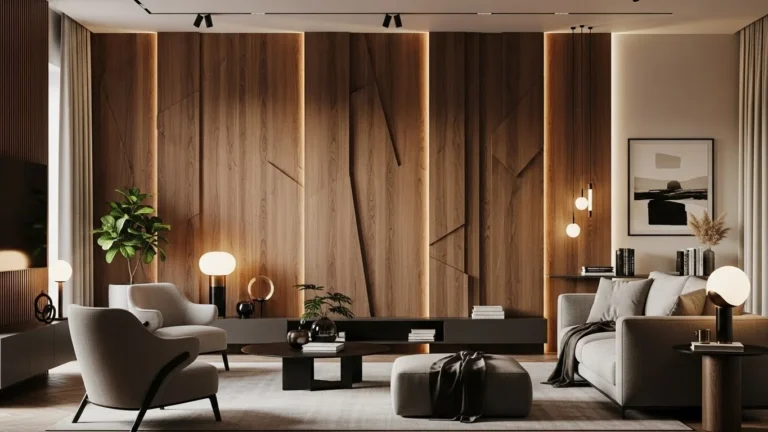
11. Red and Brown
Red paired with brown creates a grounded, warm, and earthy aesthetic.
Deep brown furniture or wooden elements complement red walls, textiles, or décor. This combination evokes comfort, sophistication, and a cozy atmosphere in living rooms, offices, or bedrooms.
Mix textures like wood grain, leather, and woven fabrics to add depth. Brown softens red’s intensity, providing balance while maintaining a rich and inviting environment.
12. Red and Purple
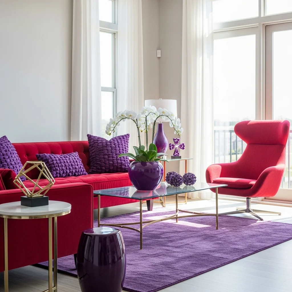
Combine red with purple for a luxurious, bold, and artistic vibe.
Deep purples enhance red’s vibrancy while creating a regal and sophisticated ambiance. This pairing works well in statement walls, decorative accents, or eclectic spaces.
Balance with neutrals like white, gray, or beige to prevent overwhelming the space. Adding metallic elements like gold or silver further enhances elegance and richness.
13. Red and Navy
Red and navy create a classic, nautical-inspired palette.
Navy tones offer contrast and depth while toning down red’s energy. This combination works for living rooms, bedrooms, and even exterior accents like doors or shutters.
Incorporate striped patterns, cushions, or rugs to emphasize harmony. Navy’s stability makes it a perfect complement for bright red accents in stylish and balanced interiors.
14. Red and Silver
Pair red with silver for a sleek, modern, and festive touch.
Silver accents in décor, lighting, or hardware highlight red’s boldness while maintaining elegance. This combination is perfect for contemporary interiors or celebratory spaces.
Use reflective materials, metallic textures, or mirrored surfaces to enhance light and sparkle. Red and silver balance vibrancy with sophistication, creating striking yet refined settings.
15. Red and Mint Green
Red paired with mint green creates a fresh, lively, and unexpected contrast.
The cool mint balances red’s warmth, making spaces feel playful yet harmonious. Perfect for kitchens, living areas, or accent décor in eclectic homes.
Layer textiles, patterns, and accessories to create cohesion. Mint green softens red’s intensity while adding brightness and visual interest to your interiors.
16. Red and Coral
Pairing red with coral creates a warm, vibrant, and energetic palette.
Coral’s softer undertones complement red without overwhelming the senses. This combination works beautifully in living rooms, accent walls, and decorative accessories.
Mix textiles, cushions, or artwork in coral shades to balance bold red furniture or décor. Layering these hues creates a lively yet harmonious environment that feels inviting and stylish.
17. Red and Olive Green
Red and olive green form a natural, earthy, and balanced pairing.
Olive tones soften red’s intensity while evoking calm and serenity. Perfect for kitchens, living rooms, or outdoor spaces, this combination feels grounded and sophisticated.
Incorporate plants, natural fabrics, or wooden furniture to enhance the earthy vibe. The subtle contrast between red and olive adds depth and visual intrigue to your interiors.
18. Red and Champagne
Combine red with champagne for an elegant, warm, and luxurious feel.
Champagne hues in lighting, fabrics, or décor soften red’s vibrancy while adding shimmer and refinement. Ideal for bedrooms, dining areas, or entryways.
Mix with metallic or reflective textures for added sophistication. Red and champagne work together to create a rich, welcoming atmosphere with subtle glamour.
19. Red and Turquoise
Red paired with turquoise produces a bold, exotic, and eye-catching contrast.
Turquoise’s cool tones balance red’s heat, creating a vibrant and dynamic environment. This combination is perfect for eclectic interiors, accent walls, or decorative accessories.
Use turquoise in cushions, rugs, or wall décor while keeping red in furniture or focal elements. This pairing enhances visual interest and energy in any space.
20. Red and Lavender
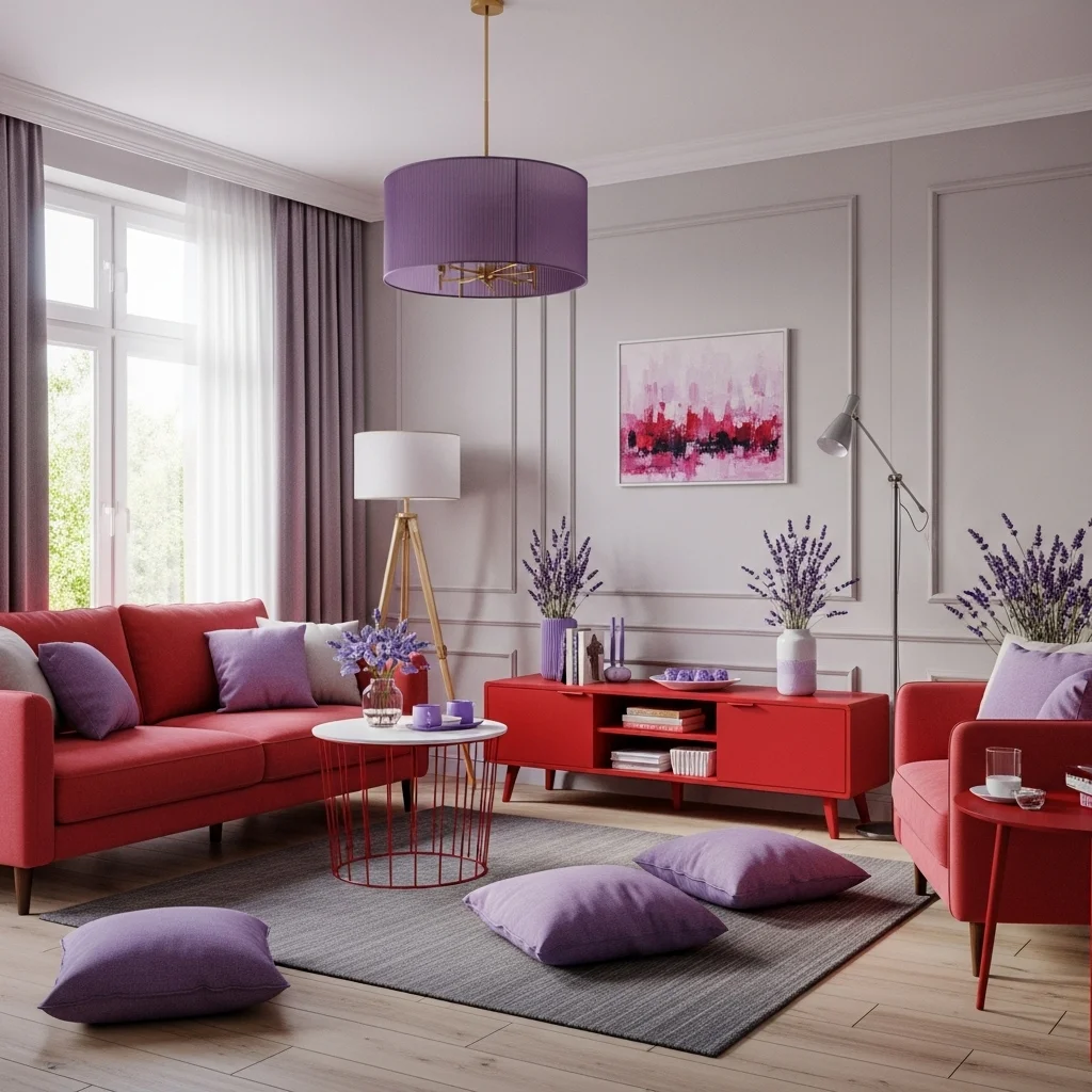
Red and lavender create a unique, soft, and romantic aesthetic.
Lavender tones soften red’s boldness, offering a subtle and elegant contrast. Perfect for bedrooms, creative spaces, or small decorative accents.
Layer textiles, artwork, and lighting to harmonize both colors. This pairing blends energy with calmness, resulting in balanced and visually appealing interiors.
Final Thoughts
Choosing the right colors to pair with red can completely transform your space. Using these 20 Colors That Go with Red, you can create interiors that feel vibrant, balanced, and stylish.
From bold contrasts like red and black to soft harmonies like red and lavender, each combination offers versatility for various rooms and moods. Layering textures, accents, and complementary shades ensures your red elements shine without overwhelming the space.
With thoughtful pairing, red becomes a dynamic base color that enhances furniture, décor, and architectural features. Creativity in color selection allows you to craft unique, personalized, and visually stunning interiors.
FAQs
1. What colors go best with red in small spaces?
Neutral tones like beige, white, and gray complement red while keeping spaces open and airy. Secondary keyword: colors that go with red.
2. Can red be paired with multiple colors in one room?
Yes, using complementary accents like teal, gold, or coral adds depth and personality.
3. How do I balance bold red walls with furniture?
Use neutral or complementary colors in furniture and décor to prevent visual overload.
4. Is red suitable for bedrooms?
Yes, but balance with soft tones like lavender, beige, or mint green for a calming effect.
5. How do I choose accent colors for red décor?
Select colors based on mood, style, and the visual contrast you want. Tertiary keyword: interior color combinations.