18 Colors That Go With Pink for Stylish, Balanced, and Beautiful Interior Palettes
Pink is one of the most expressive colors in interior design — soft yet vibrant, warm yet refreshing, playful yet elegant. These colors that go with pink show how beautifully versatile it can be when paired thoughtfully. Whether you lean toward dusty blush, bold fuchsia, pastel rose, or a muted pink-beige, pink adapts gracefully to almost any mood you want to create. When combined with the right tones, it brings emotional warmth, depth, and harmony into a room, making the space feel intentional and welcoming.
What makes pink so dynamic is its emotional range. Soft blush can feel calm and romantic, while brighter pinks add energy and personality. When paired with neutrals, pink becomes refined and grounded; when matched with bold shades, it becomes expressive and modern. The key is understanding how each companion color shifts the mood — adding balance, contrast, or gentle softness. These pairings help you explore pink’s full potential, letting it shine as a powerful design element.
In this guide featuring 18 colors that go with pink, you’ll discover combinations that feel chic, cozy, modern, or timeless — giving you endless inspiration for interiors, décor, fashion, and creative styling.
1. White — For Clean, Fresh, Airy Balance
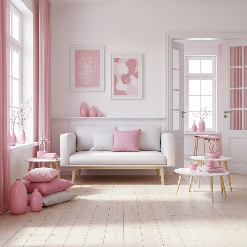
White is one of the most classic colors that complement pink beautifully. Crisp white brings brightness and simplicity, allowing pink to become the soft, glowing focal point. Whether in bedrooms, bathrooms, or living rooms, this pairing feels clean, elegant, and effortlessly calming.
This idea reflects the soothing harmony behind pink color combinations, creating a space that feels light, balanced, and refreshingly modern. White keeps pink grounded and airy, making the palette feel graceful and timeless.
2. Gold — For Glamorous, Warm, and Luxurious Contrast
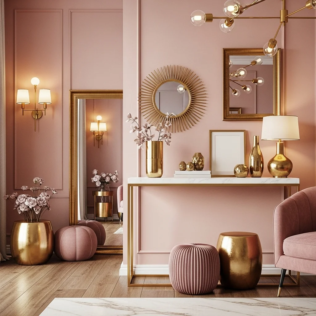
Gold accents bring warmth and sophistication to pink, creating a palette that feels upscale and feminine without being overwhelming. Whether through mirrors, lamps, hardware, or décor pieces, gold adds a subtle glow that deepens pink’s softness.
This idea highlights the refined richness of decorating with pink, where metallic warmth elevates pink’s delicate charm. The pairing feels glamorous, inviting, and ideal for spaces that need a touch of luxury.
3. Grey — For Modern, Calm, and Understated Harmony
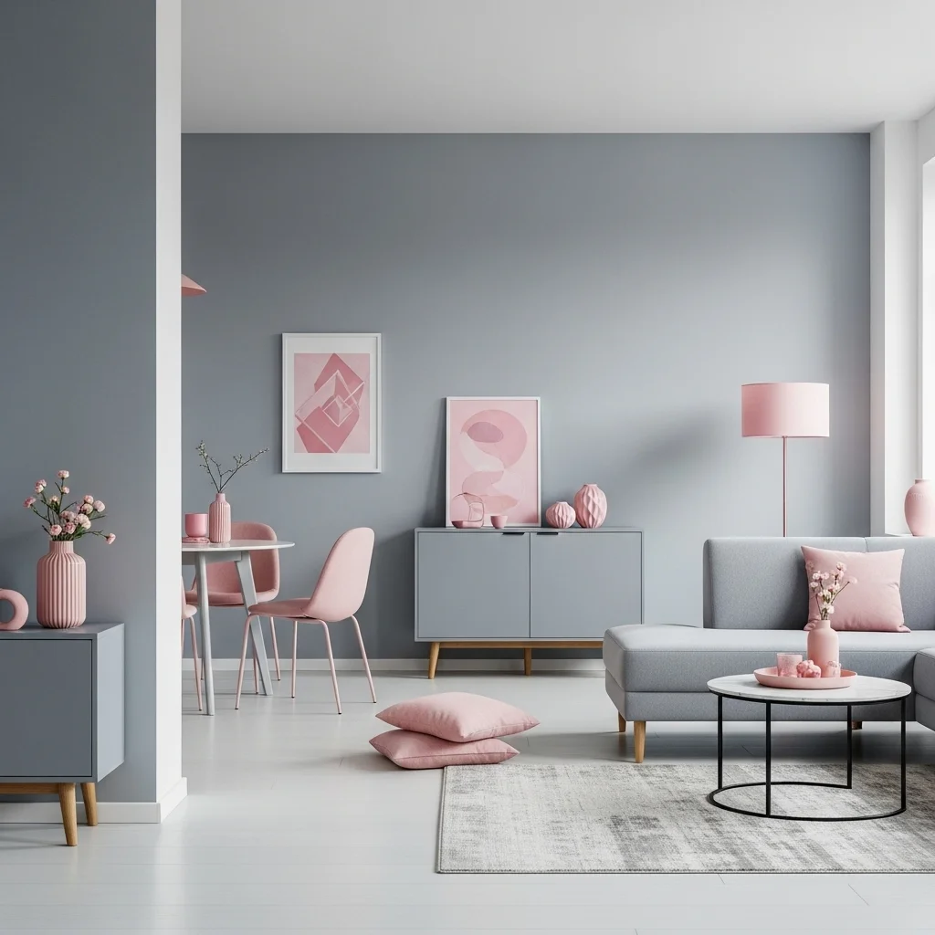
Soft or charcoal grey balances pink with cool neutrality, creating a modern, serene combination. Grey tones soften brighter pinks and add depth to pastel shades, making this pairing timeless and versatile in both minimal and contemporary interiors.
This idea emphasizes the gentle elegance of interior color harmony, using grey to create a calming backdrop that lets pink shine naturally without dominating the space.
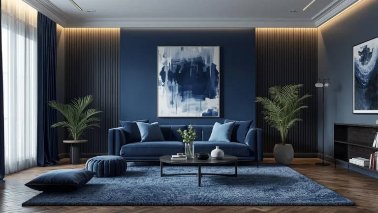
4. Navy Blue — For Bold, Sophisticated Contrast
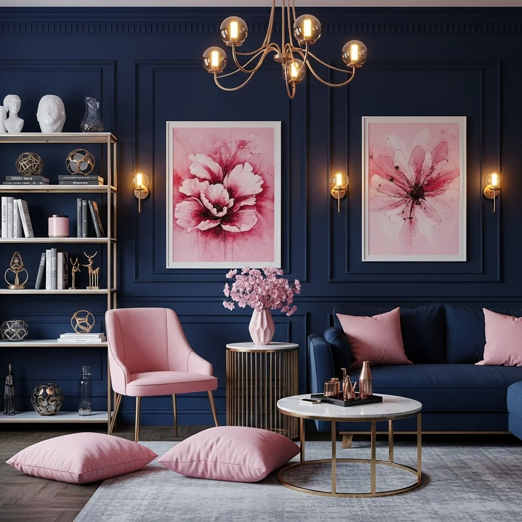
Navy blue and pink create a powerful contrast that feels stylish, polished, and slightly dramatic. The deep richness of navy grounds pink’s sweetness, making the palette feel grown-up and refined. This combination works beautifully in living rooms, offices, and dining areas.
This idea captures the elevated charm of colors that go with pink, with navy adding confidence and depth while pink brings warmth and lightness. Together, they create a balanced, expressive pairing.
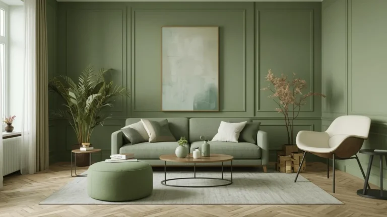
5. Olive Green — For Earthy Warmth and Modern Natural Tone
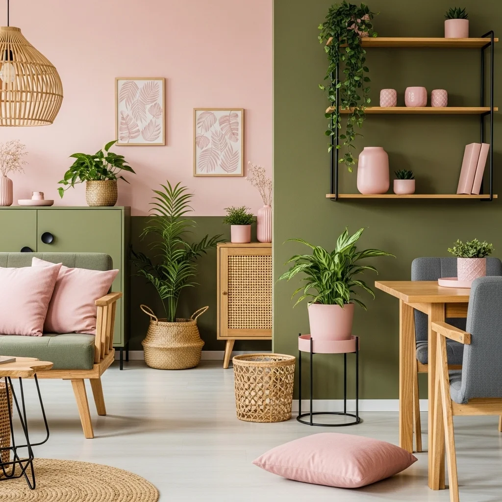
Olive green introduces an organic element that beautifully complements warm pinks and blush tones. This pairing feels grounded, earthy, and sophisticated — ideal for nature-inspired interiors, bohemian styling, or modern eclectic homes.
This idea reflects the emotional depth of pink color combinations, merging nature’s softness with pink’s romantic glow. Olive adds structure and strength, giving the palette a comforting, balanced feel.
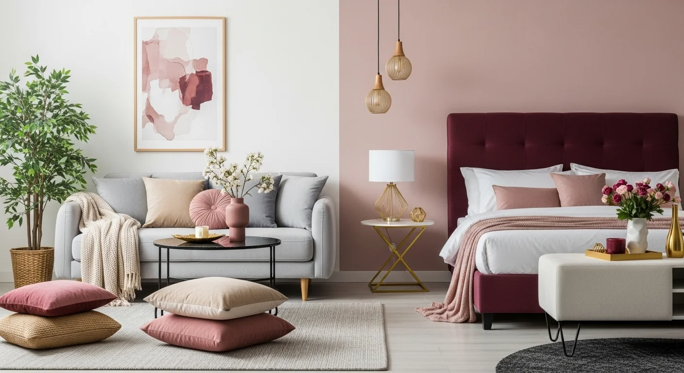
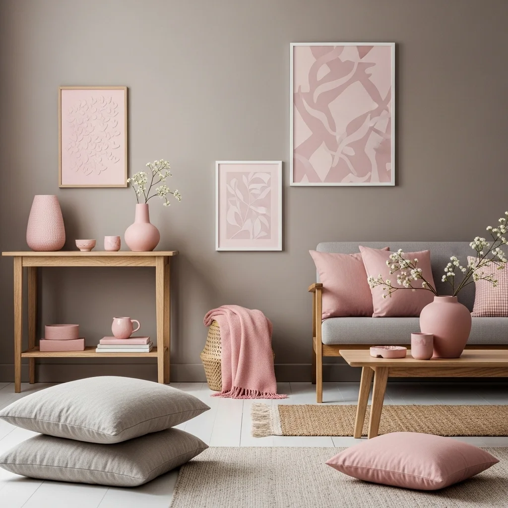
6. Beige or Cream — For Soft, Neutral, Timeless Warmth
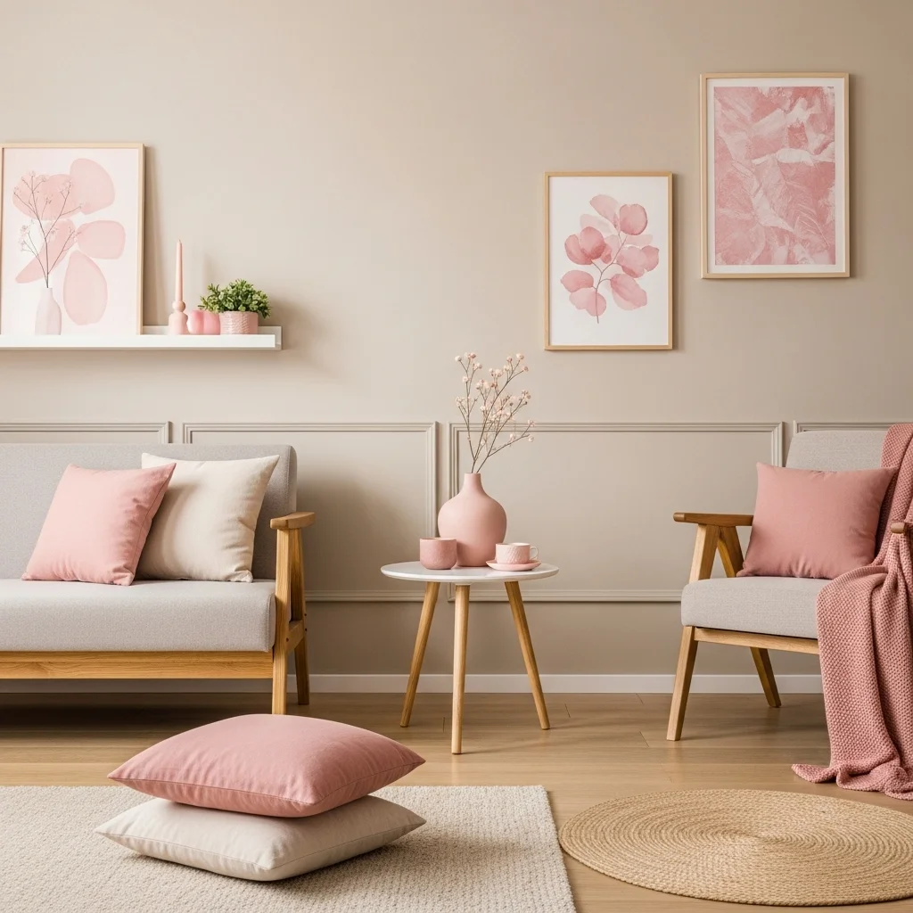
Beige and cream enhance pink with warmth and subtlety. These colors create a monochromatic feel when paired with muted pinks, making the space feel elegant, calm, and timeless. Together, they create a soft, dreamy palette perfect for bedrooms and cozy living spaces.
This idea highlights the soft serenity in decorating with pink, inviting warmth and subtle luxury into the room. Beige deepens pink’s softness while maintaining a peaceful, harmonious atmosphere.
Read also. 20 Paint Ideas for Mobile Homes
7. Black — For Modern Contrast and Bold Sophistication
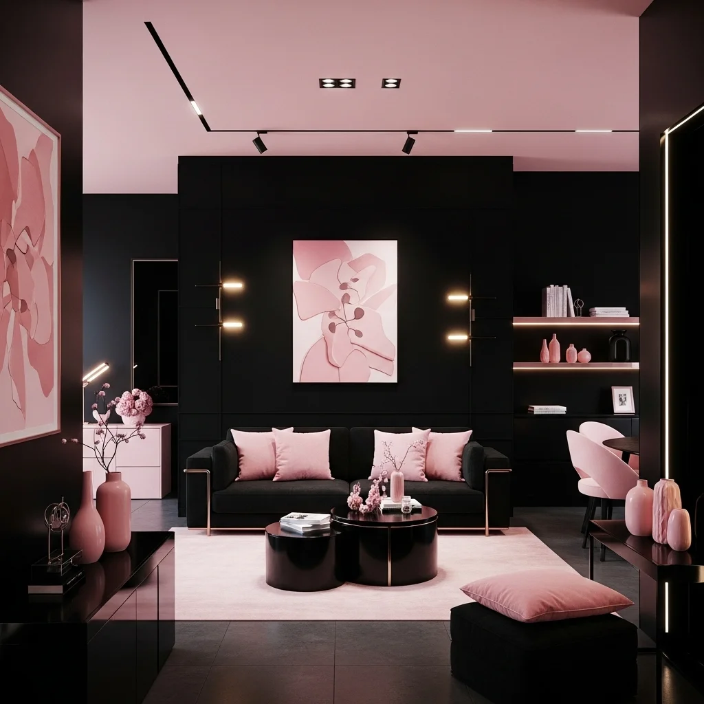
Black paired with pink creates a striking, confident contrast that feels contemporary and chic. The dark depth of black sharpens pink’s vibrancy, adding a dramatic edge that works beautifully in statement areas like offices, dining rooms, or modern glam bedrooms.
This idea enhances the bold synergy in colors that go with pink, balancing light and dark with intentional elegance. Pink feels brighter and more expressive against black’s grounding presence.
8. Sage Green — For Soft, Fresh, Nature-Inspired Harmony
Sage green’s gentle, muted tones blend beautifully with blush pink, creating a calming, nature-inspired palette. This combination feels earthy, balanced, and soothing — perfect for bedrooms, kitchens, or bathrooms where peace is essential.
This idea captures the organic gentleness behind interior color harmony, weaving together soft pink warmth with sage’s natural coolness to create a serene, grounded environment.
9. Mustard Yellow — For Warm, Retro, and Playful Contrast
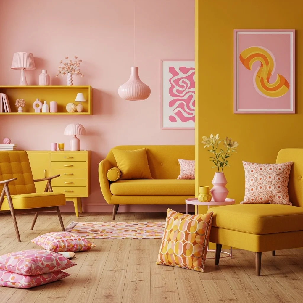
Mustard yellow brings cheerful warmth that instantly energizes pink. The combination feels vintage-inspired yet modern, creating dynamic contrast without clashing. Mustard adds richness, while pink softens the overall look.
This idea reflects the playful side of pink color combinations, offering a warm and expressive palette that feels artistic and full of personality.
10. Light Blue — For Refreshing, Sweet, and Soft Contrast
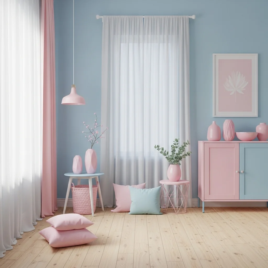
Light blue softens pink beautifully, creating a refreshing pastel combination that feels gentle, airy, and harmonious. This pairing is reminiscent of spring skies and childhood nostalgia, lending sweetness and softness to any space.
This idea enhances the tender clarity within decorating with pink, blending two soothing shades to create a palette that feels uplifting, peaceful, and full of quiet charm.
11. Charcoal — For Moody Depth and Modern Balance
Charcoal grey introduces a moody, dramatic presence that beautifully counterbalances the softness of pink. The rich depth of charcoal allows pink — whether blush, rose, or fuchsia — to feel more grounded and sophisticated. This pairing works wonderfully in bedrooms, living rooms, or bathrooms where you want a cozy yet contemporary aesthetic.
This idea highlights the bold refinement behind colors that go with pink, using charcoal’s strength to stabilize pink’s warmth. The result feels mature, stylish, and emotionally layered, bringing harmony and modern edge into the room.
12. Forest Green — For Luxurious Contrast and Organic Elegance
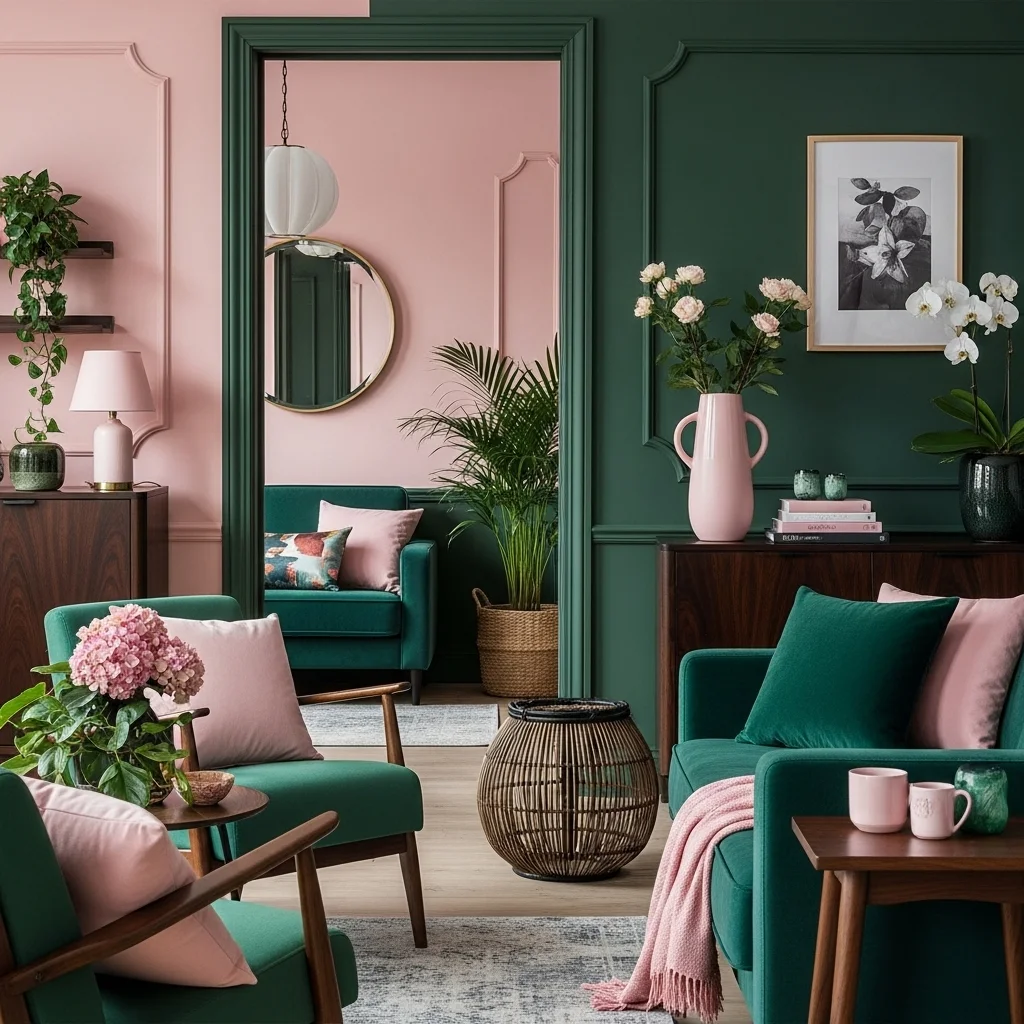
Forest green and pink create a high-impact palette reminiscent of botanical beauty. The deep green adds richness and grounded calm, while pink introduces freshness and delicate warmth. Together, they feel lush, modern, and slightly dramatic — perfect for accent walls, furniture, or bold décor moments.
This idea reflects the powerful natural harmony in pink color combinations, merging deep greenery with soft pink to evoke a balanced, earthy sophistication. The pairing feels both refreshing and opulent, adding emotional depth to any interior.
13. Chocolate Brown — For Cozy Warmth and Classic Comfort
Chocolate brown adds warmth, richness, and coziness to pink interiors. The chocolate tones deepen the palette, making pink feel more mature and grounded. This combination evokes the comfort of vintage design and earthy elegance, especially in bedrooms or living spaces.
This idea captures the inviting charm behind decorating with pink, blending warm brown tones with soft pink to create a palette that feels nurturing, timeless, and beautifully grounded.
14. Taupe — For Subtle Neutral Harmony
Taupe’s muted warmth pairs beautifully with blush or dusty pink, creating a palette that feels refined and peaceful. This combination leans toward a soft, organic neutral look — ideal for minimalist or Scandinavian-inspired interiors where subtlety is key.
This idea supports the serene elegance within interior color harmony, blending two warm neutrals to create gentle depth. Taupe enhances pink’s softness without overpowering it, producing a calm and cohesive atmosphere.
15. Emerald Green — For Jewel-Tone Drama and Vibrant Luxury
Emerald green enhances pink with a bold, glamorous contrast. The jewel-like richness of emerald brings sophistication, while pink softens the palette with warmth and brightness. This pairing creates a lush, high-end look ideal for statement furniture, accent walls, or vibrant decor.
This idea highlights the artistic boldness behind colors that go with pink, turning everyday interiors into expressive, jewel-toned spaces filled with luxury and depth.
16. Silver — For Cool Elegance and Soft Radiance
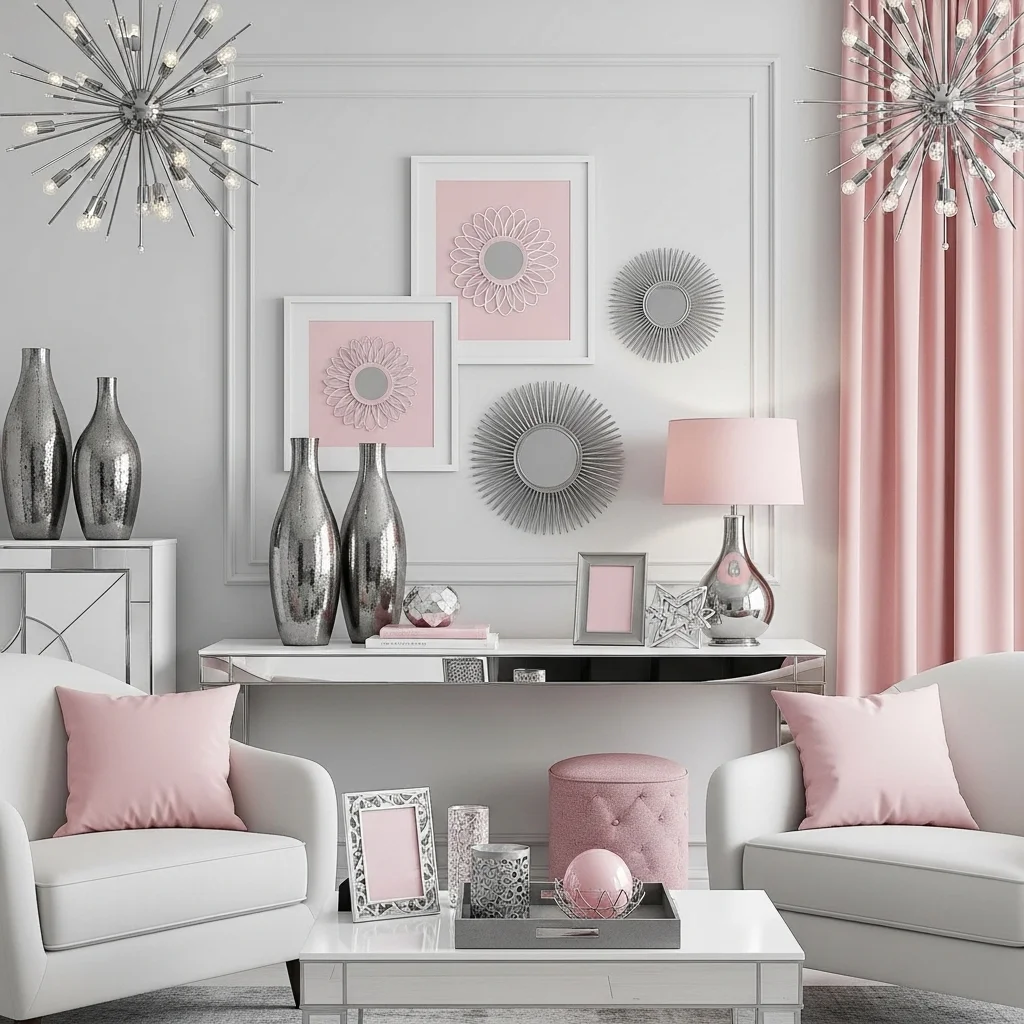
Silver adds a cool, reflective shimmer that pairs beautifully with pink’s warmth. When used in lighting, frames, fabrics, or hardware, silver introduces sophistication without feeling heavy. It enhances pink’s brightness while maintaining a clean, airy feel.
This idea embodies the modern refinement in pink color combinations, blending metallic sheen with soft hues to create a palette that feels polished, graceful, and quietly luxurious.
17. Coral — For Energetic Warmth and Tonal Harmony
Coral’s warm, orange-pink undertones pair beautifully with lighter or darker pinks, creating a harmonious monochromatic palette full of energy. The combination feels lively and expressive while maintaining a cohesive, modern flow.
This idea highlights the warm vibrancy found in decorating with pink, using coral’s brightness to enhance the room’s sense of joy and playfulness. It’s perfect for artistic, bold, or bohemian-inspired interiors.
18. Black & White Combo — For Modern Chic Contrast
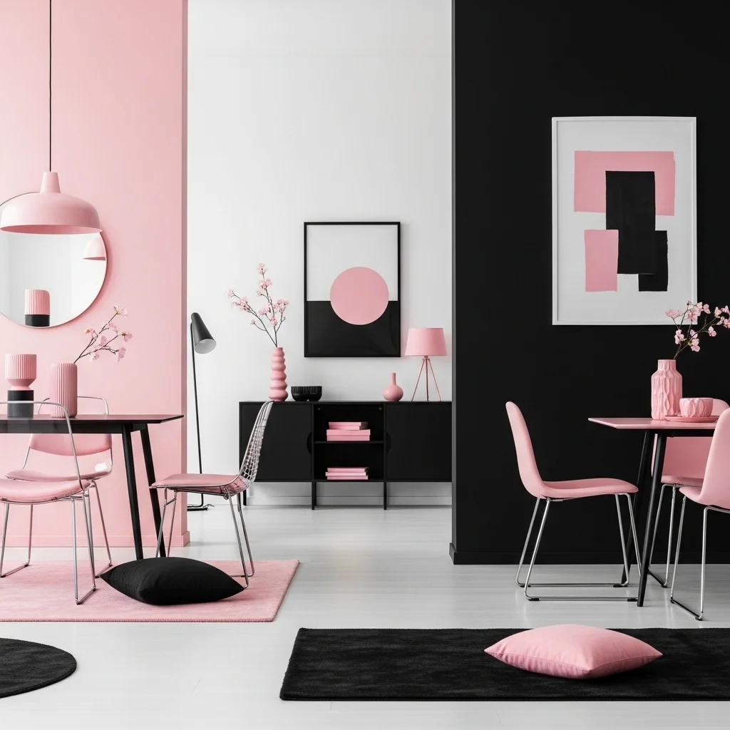
Pairing pink with a black-and-white palette creates a high-contrast look that feels crisp, modern, and stylish. The black adds grounding strength, the white provides balance, and the pink introduces a warm, expressive pop. This trio works beautifully in contemporary, glam, or minimal interiors.
This idea reinforces the bold clarity within interior color harmony, blending structure, brightness, and warmth in a visually striking palette. Together, the three shades create an effortlessly chic atmosphere.
Final Thoughts
Pink is a wonderfully expressive color, and these colors that go with pink show how adaptable it is when paired thoughtfully. Whether combined with soft neutrals, deep jewel tones, or warm earthy shades, pink transforms the mood of a space — offering warmth, elegance, or playful vibrancy. Each pairing reveals a unique emotional tone, allowing pink to move gracefully between serene minimalism and bold, artistic flair.
What makes pink truly special is its ability to complement both warm and cool palettes, making it one of the most versatile hues in interior design. When balanced with grounding colors like grey, navy, or charcoal, pink gains sophistication; when paired with greens or yellows, it feels fresh and organic. These color combinations help you express your personal style while giving your home depth, harmony, and visual richness.
With intentional mixing and curated accents, pink can become a grounding neutral, a vibrant highlight, or a refined focal point. These ideas invite you to see pink not just as a feminine shade but as a powerful color that brings warmth, energy, and emotional clarity to any space.
FAQs About Colors That Go With Pink
Q1: What is the most versatile color to pair with pink?
White and grey are the most adaptable, offering clean, balanced backdrops for any shade of pink.
Q2: Which colors make pink look more sophisticated?
Charcoal, navy, black, and emerald give pink depth and elegance.
Q3: What colors create a modern palette with pink?
Black, taupe, sage, and metallics like silver or gold.
Q4: Can pink pair well with warm colors?
Absolutely — mustard, coral, and chocolate brown complement pink beautifully.
Q5: Which shade of pink is easiest to style?
Dusty blush is the most flexible, pairing effortlessly with both bold and neutral tones.