10 Colors to Absolutely Avoid in Your Bedroom for a Calmer, Better, and More Restful Space
Choosing the right colors for a bedroom is more important than most people realize. Your bedroom is a space for rest, emotional reset, and deep relaxation — and the colors surrounding you directly influence how calm, balanced, and peaceful you feel. Understanding the colors to absolutely avoid in your bedroom helps set the foundation for a space that nourishes your well-being instead of draining it. While some colors might be energizing or expressive in other parts of the home, the bedroom requires hues that feel gentle, grounding, and aligned with the natural rhythm of rest.
Color psychology plays a significant role in sleep quality. Certain tones heighten alertness, stimulate the mind, or introduce tension — all of which disrupt the serene atmosphere a bedroom should promote. Avoiding these shades is a step toward creating a sanctuary where your nervous system can unwind and your mind can disconnect from the outside world. The goal is to craft a space where textures, light, and tone work together to soothe rather than overstimulate.
As you explore these colors to absolutely avoid in your bedroom, you’ll discover why some hues interfere with sleep, trigger restlessness, or diminish the calming effect of the space. Each section breaks down what makes the color problematic and guides you toward alternatives that feel softer, warmer, and more restorative. With thoughtful choices, your bedroom becomes a peaceful retreat that supports better sleep, deeper comfort, and emotional balance.
1. Bright Red
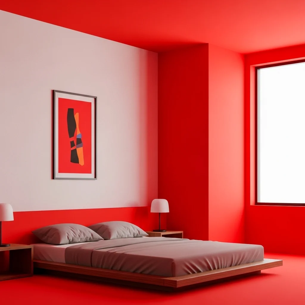
Bright red is one of the most stimulating colors you can introduce into a bedroom. It increases heart rate, heightens energy levels, and activates emotional intensity — the exact opposite of what a restful space needs. While red may work beautifully in dining rooms or living spaces, it brings too much visual heat and psychological tension for sleep.
This idea aligns with the calming intention behind avoiding bedroom color mistakes, showing how vibrant, passionate shades can disrupt your nighttime routine. Bright red pulls the eye instantly and keeps the mind alert, preventing your bedroom from feeling serene. Softer clay reds or terracotta, however, can offer warmth without overwhelming the senses.
2. Neon Yellow

Neon yellow is extremely bright and mentally stimulating, often associated with alertness, attention, and high energy. In a bedroom, it becomes overpowering, creating visual stress that makes it difficult to unwind. This intense hue reflects excessive light and can feel harsh at both day and night.
This idea highlights the disruptive nature of overstimulating hues, showing how neon tones overstimulate the mind. The electric quality of neon yellow makes the bedroom feel chaotic and unbalanced, robbing the space of its calm energy. Instead, muted golds or pale buttery yellows bring warmth without the intensity.
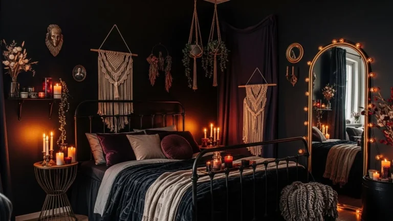
3. Jet Black

While black can be elegant in moderation, using it as a dominant bedroom color creates heaviness and emotional weight. Large black walls or furniture absorb light and make the room feel smaller and more enclosed, disrupting mental clarity. The color can also evoke feelings of isolation or sadness if not paired with softer tones.
This idea connects to the emotional challenges of sleep-disrupting color choices, reminding you that darkness must be balanced with warmth. When used sparingly, black adds sophistication — but as the main color, it makes the bedroom feel too somber. Soft charcoal or deep gray-blue tones are gentler alternatives.
Read also. 15 Bali Bedroom Ideas
4. Electric Blue

Electric blue may look refreshing in trendy settings, but its bold vibrancy stimulates alertness rather than relaxation. The color feels visually loud, pushing the mind into a state of activity rather than rest. At night, electric blue reflects artificial light aggressively, making the room feel colder and sharper.
This idea reflects the importance of avoiding harsh bedroom tones, as overly vivid blues energize rather than soothe. While blue itself is calming, choosing muted dusty blues or soft ocean tones creates a peaceful environment much more aligned with restful sleep.
5. Bright Orange
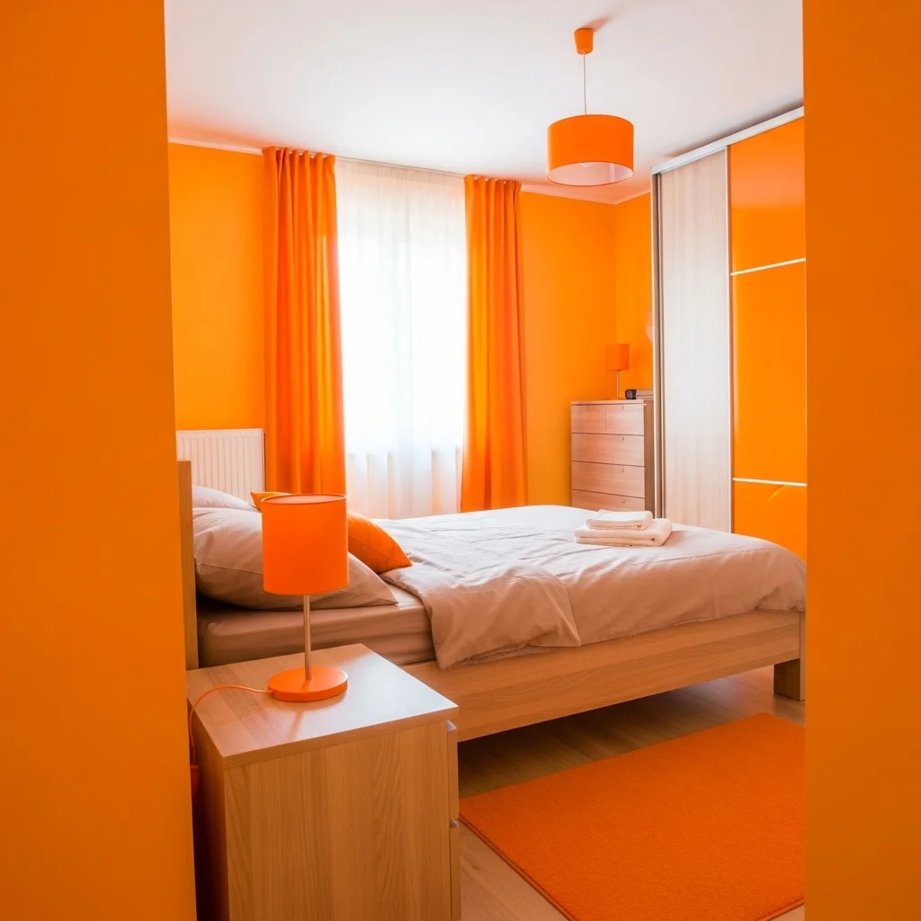
Bright orange is cheerful and warm, but its energetic nature is too uplifting for a bedroom. It evokes creativity, motivation, and excitement — emotions better suited for workspaces or living areas. In a bedroom, bright orange disrupts the sense of quiet serenity your mind needs to settle.
This idea underscores why avoiding bedroom color mistakes is essential for emotional comfort. The intensity of bright orange overwhelms soft lighting and makes the space feel “on,” even late at night. Softer peach or terracotta tones offer warmth without overstimulation.
6. Lime Green

Lime green carries a sharp, acidic quality that overstimulates the senses. It is associated with vibrancy, freshness, and energetic movement — all elements that counteract the softness necessary for sleep. This intense green feels visually active rather than restful.
This idea expresses how overstimulating hues negatively influence the bedroom’s atmosphere. Lime green keeps the mind alert, making it harder to fully decompress. If you prefer green, choose sage, olive, or moss tones, which create a peaceful, nature-inspired environment.
7. Hot Pink

Hot pink is expressive and bold but far too stimulating for a bedroom. Its high visual intensity activates energy and excitement, making the space feel lively instead of calm. The brightness also clashes with soft lighting, making the room feel emotionally “loud.”
This idea supports your understanding of sleep-disrupting color choices, as hot pink creates a buzzing, energetic backdrop. If you enjoy pink, choose muted blush, dusty rose, or mauve shades for a soft and comforting alternative.
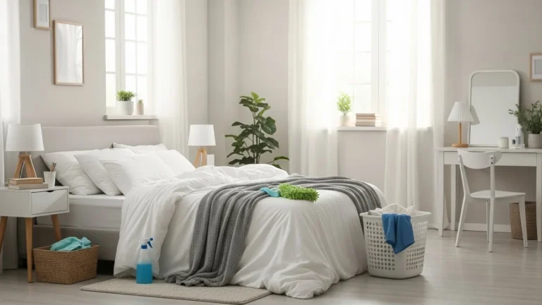
8. Pure White
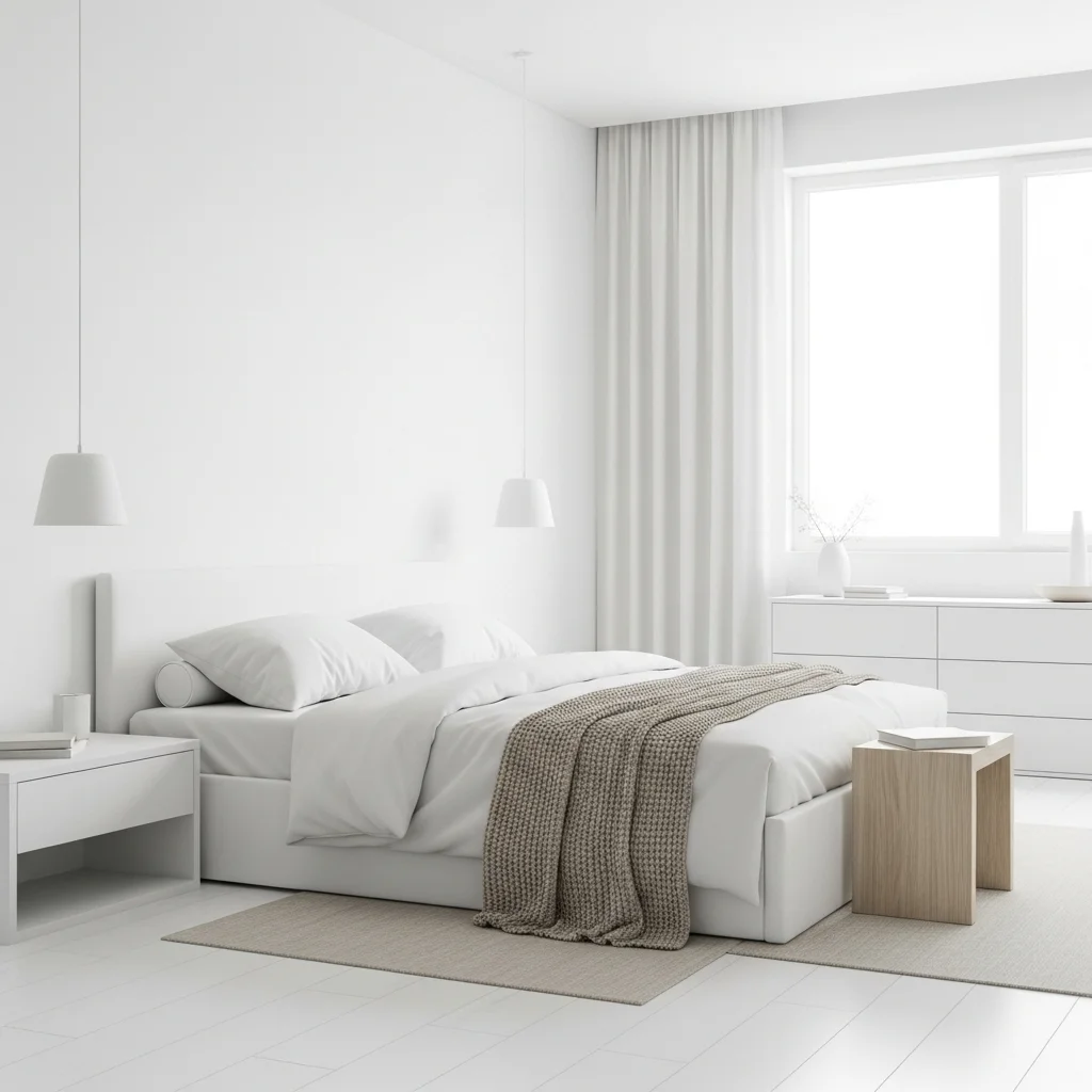
Pure white may seem safe, but its starkness can feel sterile, cold, and emotionally flat. Instead of promoting relaxation, bright white reflects light intensely and lacks the softness needed for restful sleep. It can create a clinical environment that feels too sharp and uninviting.
This idea addresses the imbalanced aesthetic within harsh bedroom tones, showing why overly bright whites disrupt warmth. Warmer whites, creamy ivories, or soft eggshell tones create a significantly cozier and more grounded atmosphere.
9. Metallic Silver

Metallic silver, especially when used heavily, creates a cold, futuristic look that lacks emotional warmth. Its reflective sheen amplifies light in ways that feel sharp and disconnected from the calming energy a bedroom needs. This makes the room feel tense rather than restful.
This idea aligns with the caution around bedroom color mistakes, as highly reflective tones can overstimulate the senses. If you enjoy metallics, opt for warm champagne or brushed gold accents that contribute softness instead of harshness.
10. Deep Purple
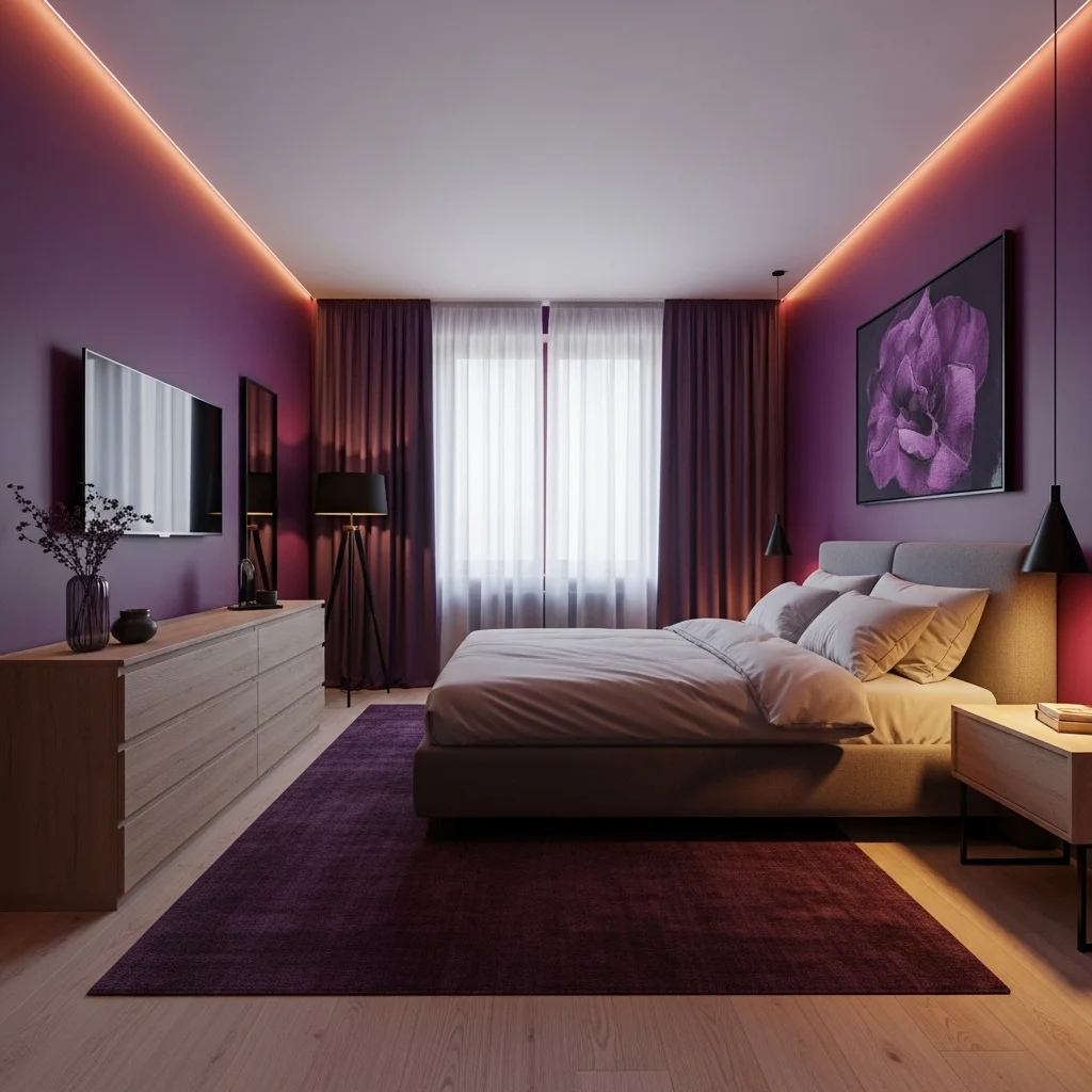
Deep purple is luxurious but carries an emotional intensity that keeps the mind active. While it adds drama, the richness of deep purple can feel overwhelming, especially in smaller spaces. It absorbs light and creates a heavy, moody atmosphere that can interfere with relaxation.
This idea emphasizes the emotional depth behind sleep-disrupting color choices, reminding you that some bold colors feel too weighty for a restful bedroom. Lighter lavender or plum-gray tones provide a gentler, more peaceful alternative.
Final Thoughts
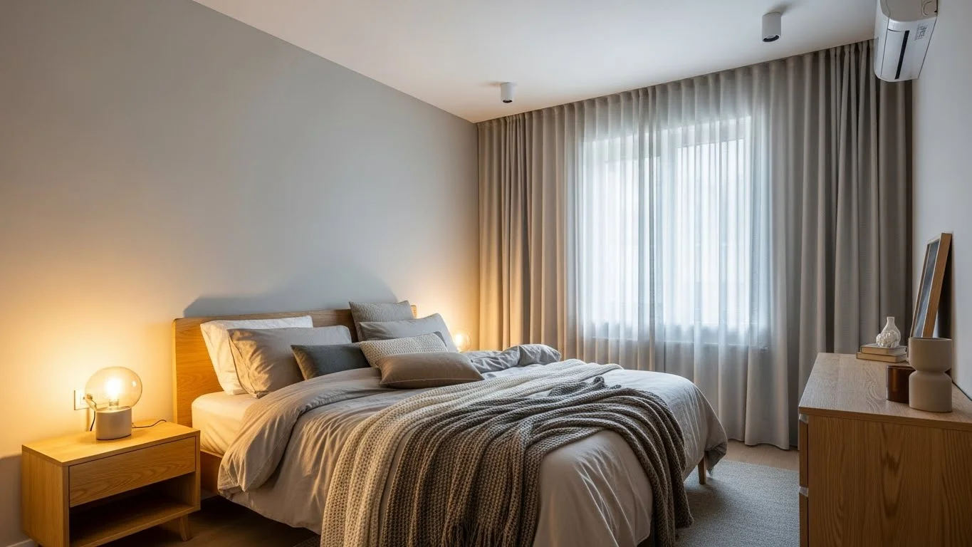
The bedroom should feel like a sanctuary — a place to restore your body and calm your mind. By understanding these colors to absolutely avoid in your bedroom, you can avoid overstimulation and choose hues that promote balance, comfort, and emotional grounding. When you steer clear of harsh, bright, or overly intense colors, your bedroom gains a soft, peaceful atmosphere that genuinely supports rest.
Choosing calming colors doesn’t limit your creativity; instead, it helps you craft a space that feels connected, intentional, and deeply soothing. Soft neutrals, warm earth tones, gentle greens, and muted blues offer the perfect combination of harmony and beauty. With thoughtful color decisions, your bedroom becomes a retreat where you can unwind, recharge, and embrace restful nights.
FAQs About Bedroom Colors
Q1: What color is most relaxing for a bedroom?
Soft blues, sage greens, warm beige, taupe, and muted neutrals are the most calming choices.
Q2: Are warm or cool tones better for bedrooms?
Both can work — as long as they’re muted, soft, and not overly bright or intense.
Q3: Can bold colors ever work in a bedroom?
Yes, but they should be used sparingly, like on décor or small accents.
Q4: Does white work in bedrooms?
Yes, but choose warm whites or creams to avoid a sterile, overly bright look.
Q5: What’s the worst color for sleep?
Bright red — its intensity stimulates energy and disrupts the mind’s ability to wind down.